Chillika
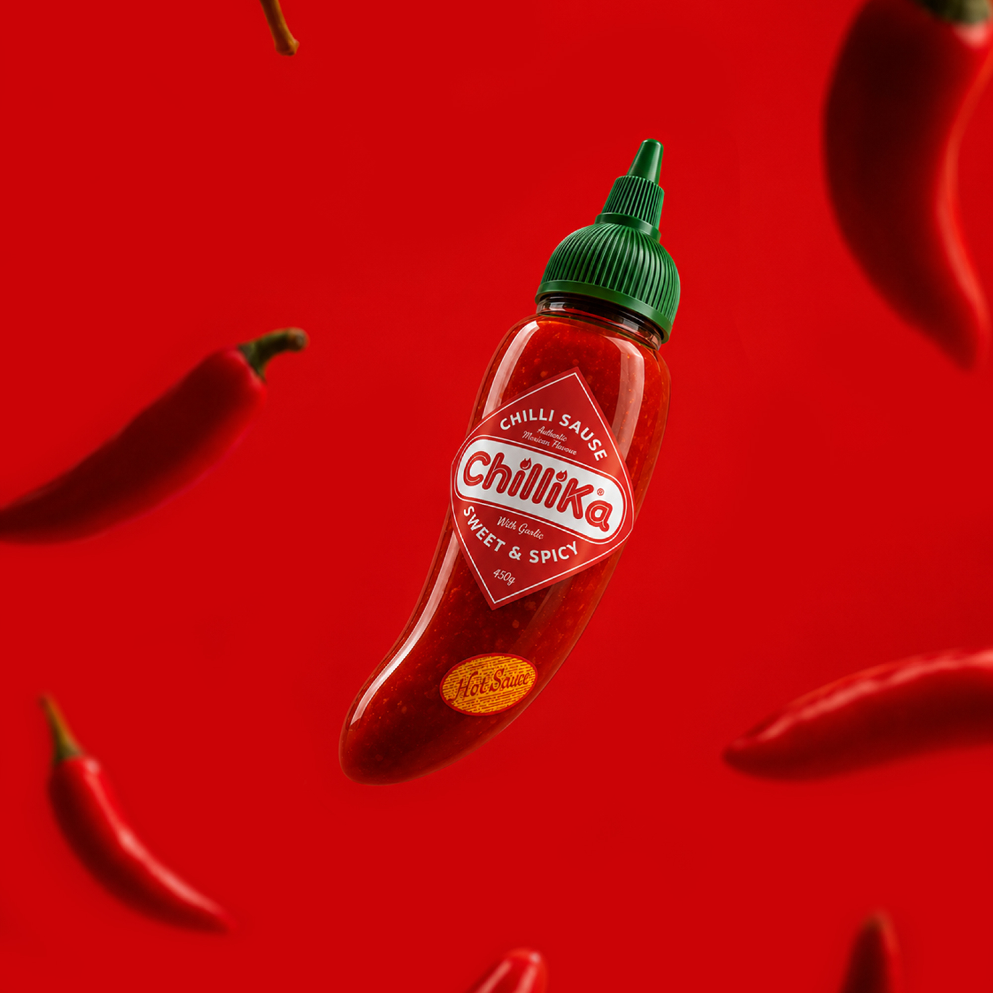
The hot sauce category is crowded with generic bottles, predictable labels, and visual languages that have barely evolved. Most brands compete on flavor or heat levels, while their packaging fades into the background. ChilliKa was created to challenge that norm by transforming an everyday condiment into something people instantly notice, remember, and proudly leave on their dining table. Rather than designing another bottle, the idea was to celebrate the ingredient that defines the product—the chilli itself.
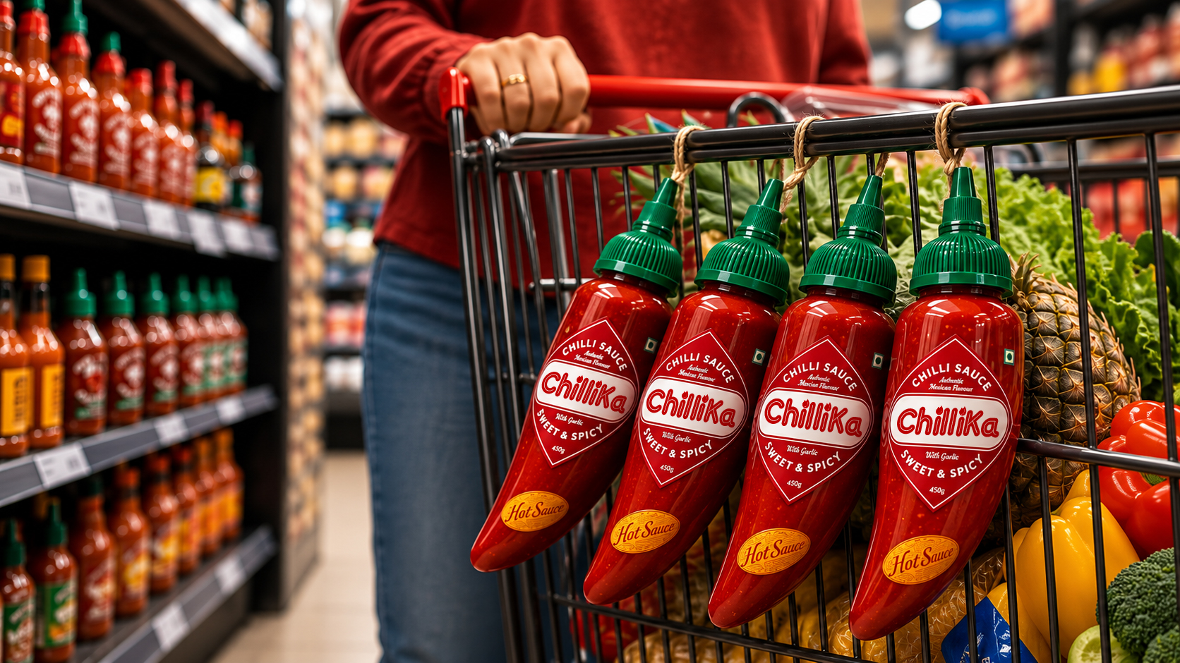
The bottle takes the form of a chilli, while the cap is designed with an integrated loop, allowing multiple bottles to be tied together and hung exactly like traditional chilli bunches. The packaging doesn't simply reference the ingredient—it behaves like it. This transforms the product into a distinctive retail display, a memorable kitchen object, and a conversation piece. The identity extends this idea through bold typography, vibrant reds, and playful communication that celebrates heat with personality.
ChilliKa isn't just another hot sauce.
It's the chilli reimagined as the brand.
Sector
Consumer Goods

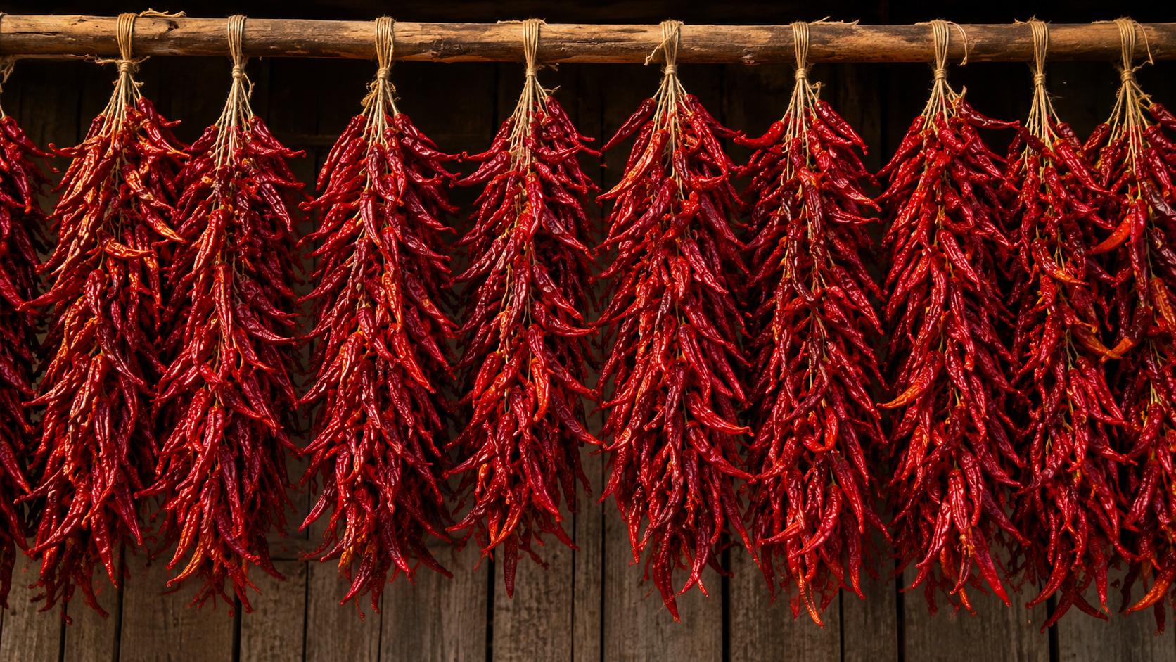
Across many cultures, freshly harvested red chillies are tied together and hung in bunches to dry. It's a familiar sight in farms, local markets, village homes, and kitchens a simple tradition that symbolizes freshness, abundance, and authentic spice. That ritual became the inspiration behind the entire brand.
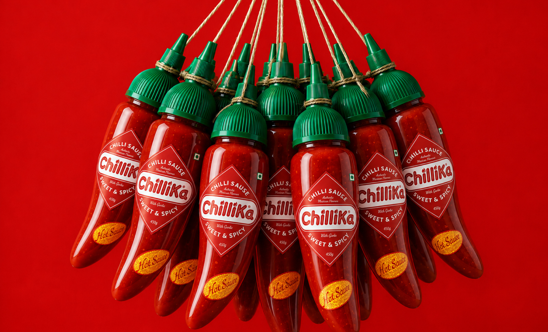
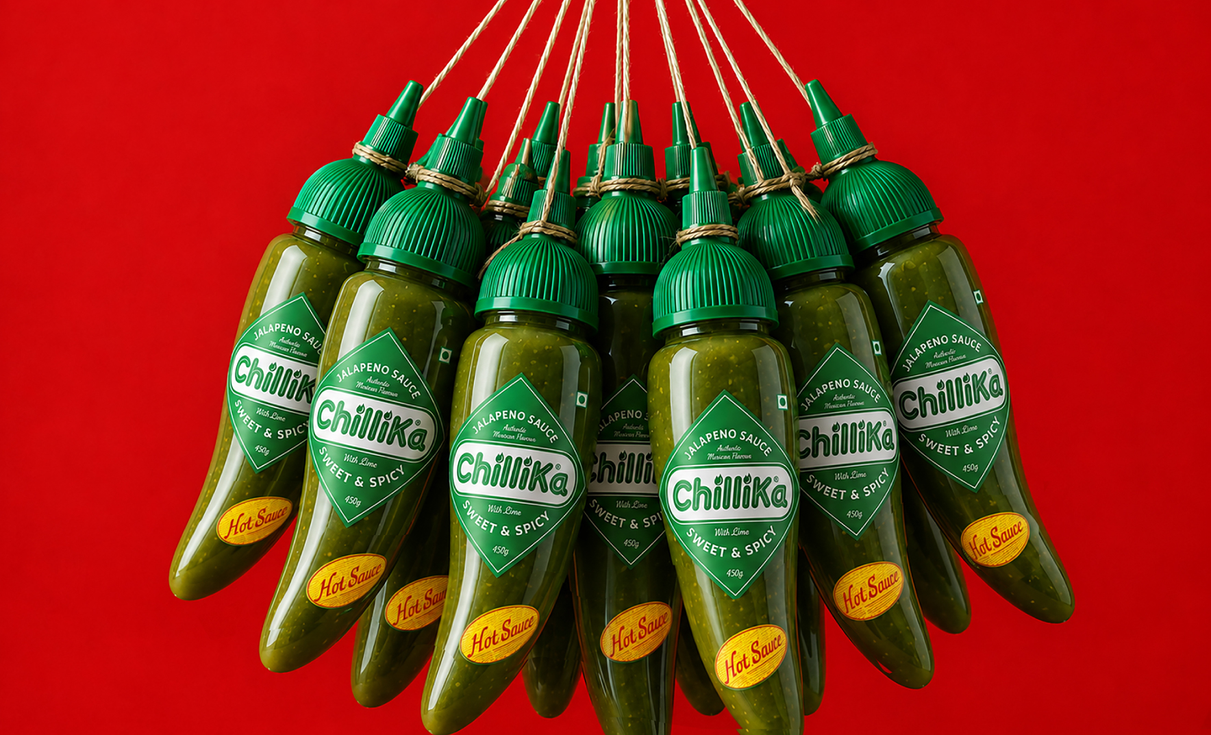
The chilli became the bottle.
The bottle became the brand.
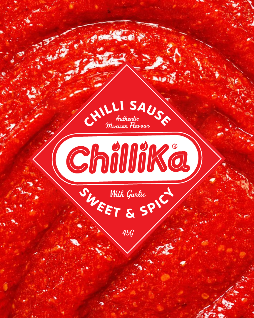
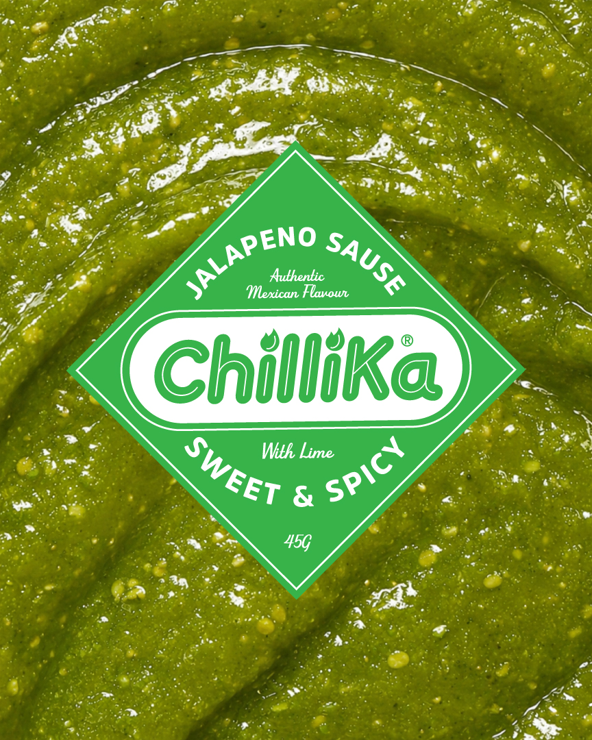
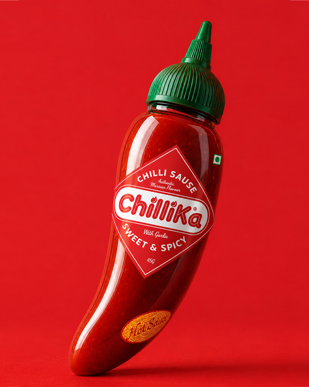
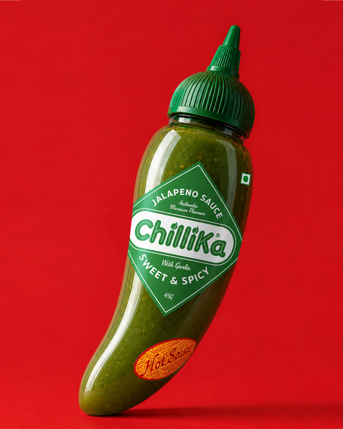
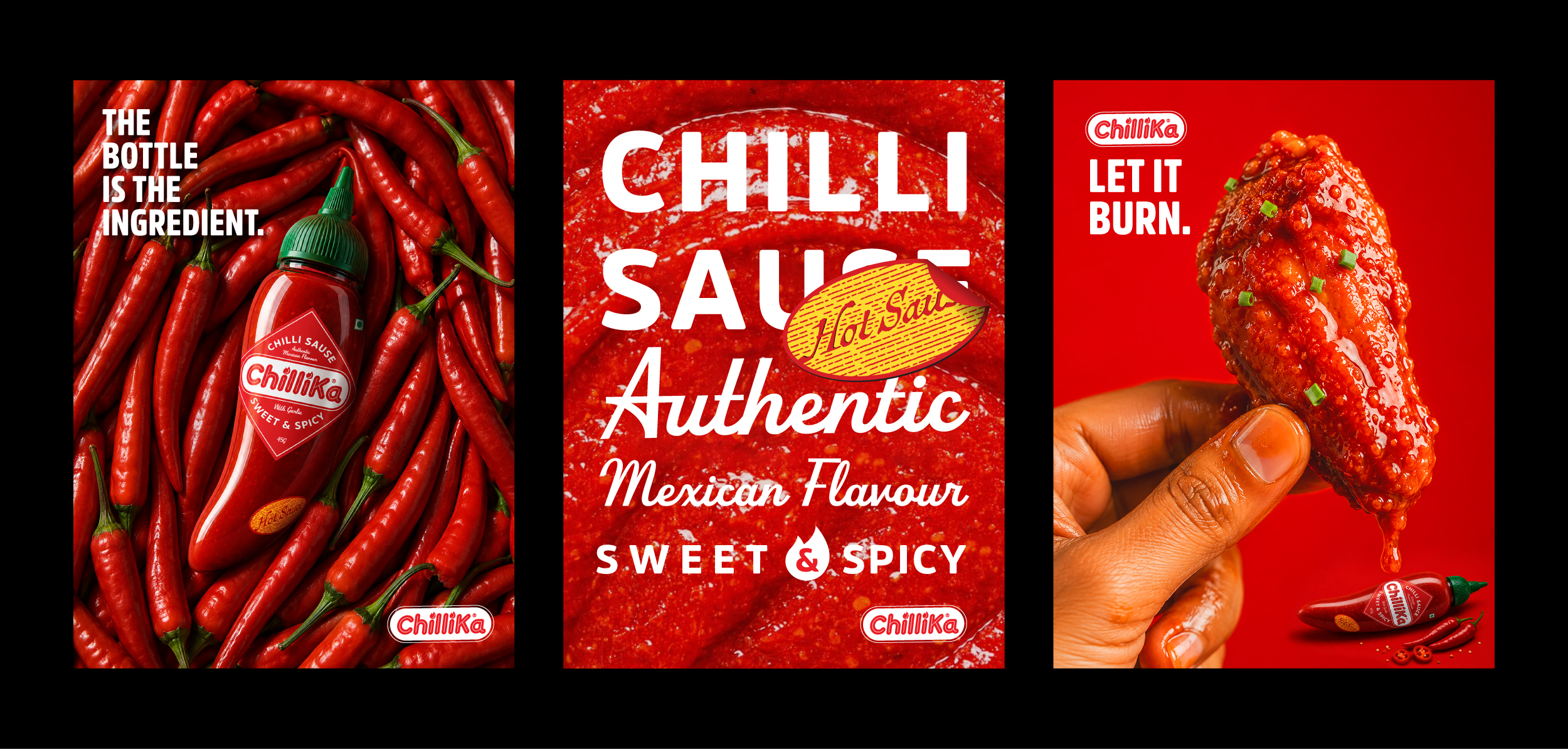
An iconic bottle for an unforgettable burn.

2026 Akshay Gupta
PROJECTS
ABOUT
SCRAP BOOK
SERVICES
CONTACT
BACK TO TOP
Let’s Talk→
Call: +91 9899307371
Email: hello@akshaygupta.co.in